Quick recap: As discussed in our last blog post, we have moved into an amazing mid-century modern (MCM) property in the quiet corner of Connecticut and are undertaking the stewardship of bringing the home back to (or beyond!) its original luster with a few MCM-appropriate enhancements and a handful of behind-the-scenes modern advancements to increase efficiencies.
Our first major undertaking was… drumroll, please… the mechanical room! Not what you were expecting? Finishing touches always get the ‘oohs’ and ‘aahs’, but the basic foundation of the systems and inner-workings of the house desperately needed to be stabilized and improved upon before any of the other (more exciting) enhancements can get any air time. So here we are…
OUR FIRST TASK: delete an oversized/under-utilized closet directly adjacent to the mechanical room and relocate the wall by about 3 feet, giving us the extra room needed to be able to reorganize equipment, pipes, and wires that were a hot mess.
AND ALSO THIS: mitigate the rusted-out bottom of our well tank that looked like it was about to give way any second. Relocating the wall allowed us to install the replacement well tank in a new location that greatly improved the flow of the room.
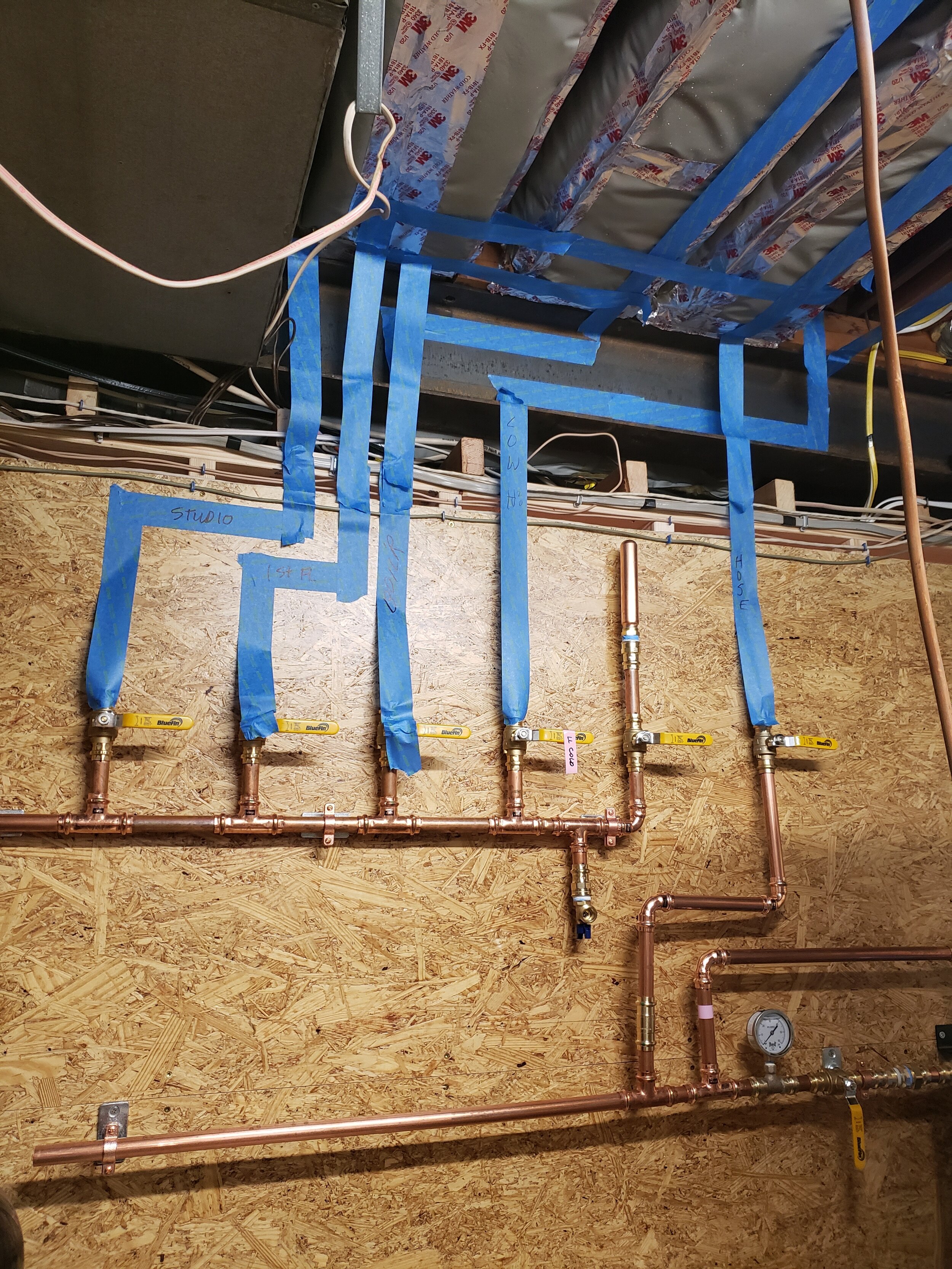
By relocating the wall and incorporating the extra space back into the mechanical room, what was once a cramped, poorly laid out mechanical room could now undergo a major reorganization and face lift. We were able to relocate some existing equipment, pipes, and wires that were previously quite haphazardly installed; and also gain enough room to be able to install some new equipment including a water softening system and some in-line water filters and monitors. The extra work it took to relocate the wall paid for itself ten-fold in the newly found organization it facilitated.
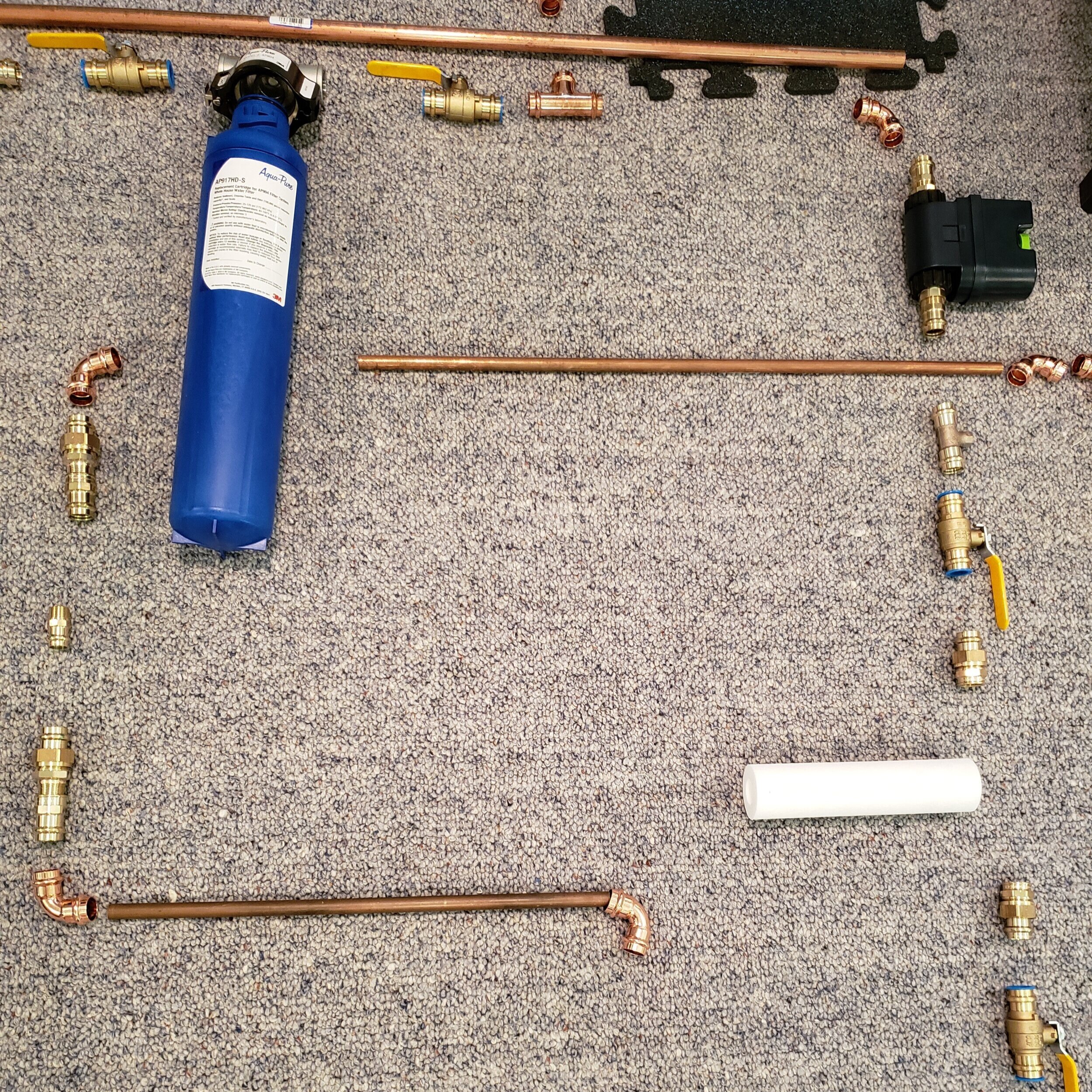
We took our time with everything, and spending the time to perfect the layout proved paramount. We laid out the proposed path of the new plumbing lines with tape and laid all of the plumbing pieces out on the floor to be sure we had everything just as we wanted it before installing anything. That way, we knew it would be perfect and we wouldn’t leave anything to chance.
Even though all of this work is totally behind the scenes and no one will really even ever get to see it or appreciate it, at least WE know it is much improved, totally organized, and done correctly.
The finished product - now isn’t that better??
So what are the key take-aways that we learned from this part of the project? It is important to work backwards from what your goals are to make sure you are taking the right steps to get you to where you want to end up.
UP NEXT: Increasing the efficiency of the exterior envelope of the house. The original R7.5 (yes, you heard that right - R7.5!) insulation isn’t going to cut it anymore…
Please do continue to follow along as we document our journey of restoring, rebuilding, and breathing new life into this gem of a home.
As a reminder, we invite you to join our Facebook group called Mid-Century Modern Homes of CT. This is a forum for Connecticut mid-century modern homeowners, admirers, enthusiasts, etc to share information regarding the appreciation and upkeep of our unique homes. Please feel free to join (even if you aren’t in CT, but are a fellow MCM admirer)! We are looking forward to seeing this group grow into a community of like-minded individuals.
November’s architecturally-significant birthday…
Happy birthday William Krisel!
One of the most influential architects of the mid-century modern era, William Krisel made his mark in southern California (particularly in Palm Springs), often incorporating butterfly rooves and blurring the lines between indoor and outdoor spaces.
What’s new in the Studio?
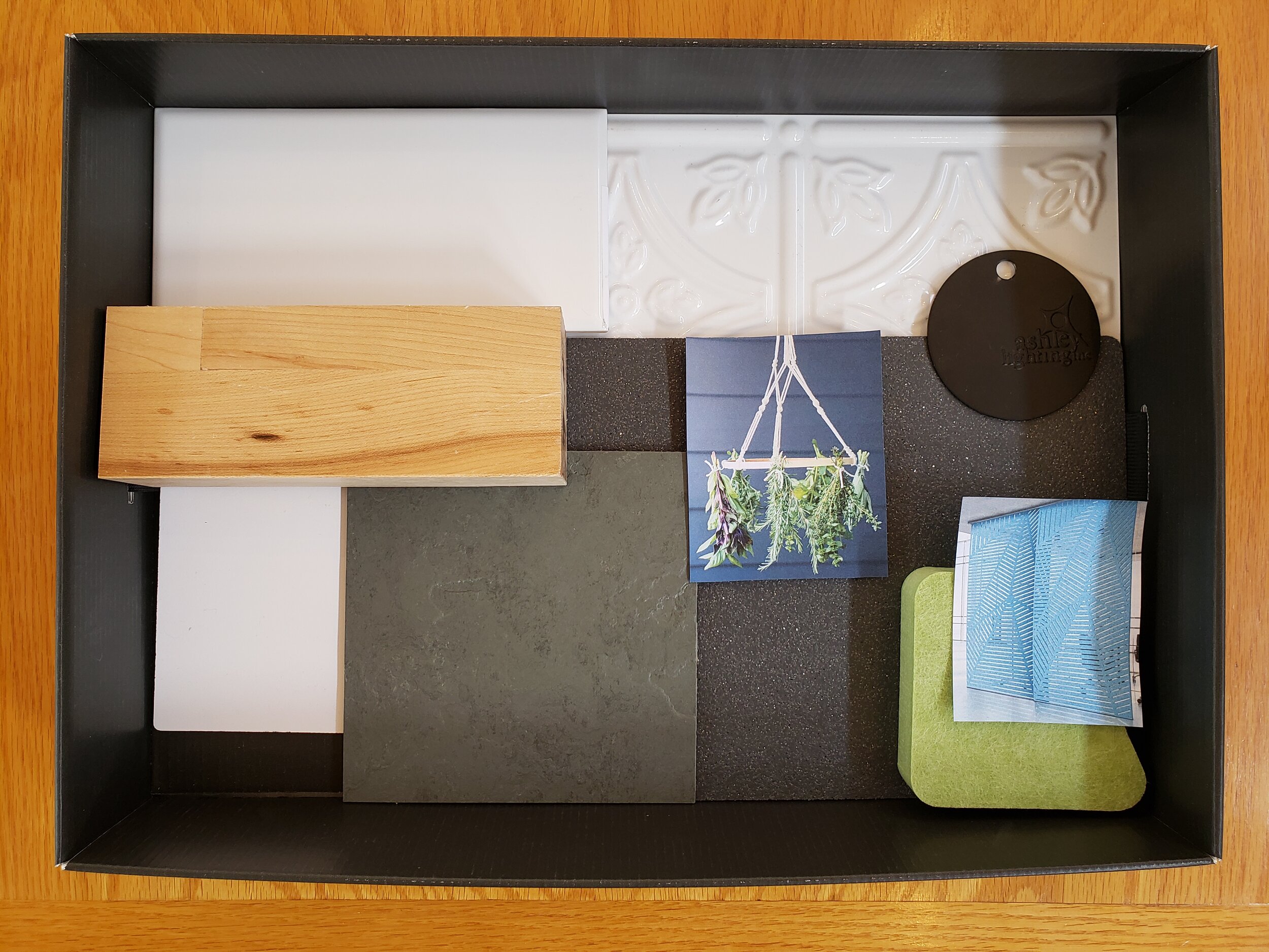
One of the recent projects that we have been working on is a cafe space in Massachusetts. We are currently selecting finishes (i.e. the fun part, says Jillian) and these are two of the schemes we have presented to the client:
The influence is Scandinavian - simple / classic / white, black, gray, and wood with accents of green. Which is your favorite? More details to come as this project progresses through the design process and (hopefully) opens in spring 2021!
Matthew Varley, AIA, NCARB Jillian Welenc, NCIDQ, LEED AP, IIDA
REGISTERED ARCHITECT / FOUNDER LICENSED CERTIFIED INTERIOR DESIGNER
p.s. hugs and kisses (socially distanced, of course)


